NORTH VANCOUVER, British Columbia (BRAIN)—Ryders Eyewear has unveiled a new brand logo and brand identity that will kick-start the festivities of its 25-year anniversary.
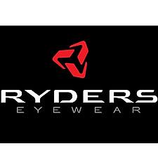
The new brand logo has been designed to reflect the fresh personality of the brand’s innovation, according to a press release. Within this new brand logo icon is a subtle “R” that appears to be moving or rotating, representing Ryder’s support of human-powered sports. The icon consists of three separate components, representing the three equally integral considerations when designing sport performance eyewear:
—The Sport/Activity the glasses are designed for
—The Conditions the glasses are intended to be used in (e.g. light, weather and location)
—The Style: because the eyes are the focal point of a person and style is an important confidence builder which aids performance
"The three pieces come together to form a solid, dynamic and protective shape, representing the overarching role of sport eyewear, which is protection," said marketing director Tara Wilkinson. “A tremendous amount of thought went into the design of our icon, as internally we see the icon as a representation of the guiding principles we use to design our eyewear: sport-specific, environment-specific and stylish. Our new logo is confident, bold and unique.”
The new logo will replace the original logo, which served Ryders Eyewear to develop grassroots support in an industry dominated by global giants for the past 25 years. Wilkinson added, “Our new branding is just the icing on what consumer and dealers will see. Our new downhill and free ride mountain bike goggles are seriously ground-breaking, and we are introducing over 20 entirely new sunglass styles, each loaded with performance features and designed specifically for bike, run and outdoor."